Hello Everyone,
Remember this post the other day when I was lamenting my choice of binding? Well, I completed it and I am okay with the choice. I am in love with the quilt though.
Thank you all for your encouragement and many of you requested to see the entire quilt to really see how the binding looked. So let's take a peek.
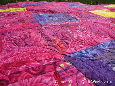
First the quilt. Don't you just love the colors? The hot pink is my favorite and the purples and yellows just make it sparkle.
A close up of the quilting. I did an edge to edge design on this quilt. The reasoning behind this is that usually on busy fabrics or quilts it is more difficult to see any type of custom quilting. And also, this quilt will get used and won't just hang on a wall.
Here is a peek at the binding on the front of the quilt. I was trying to achieve a look where the binding just blended in with the top. Possibly, I could have gone with more of a HOT pink color. But this works... okay.
Here is the entire quilt, named Fabulous. From afar, the binding really does seem to blend, so I can live with that. I really just love the entire quilt. The pattern is from 4th and 6th Designs.
Here you can see the binding on the back of the quilt. I like the contrast here.
The fun backing really makes a statement. Shameless plug here... the backing fabric can be found in the Clearance Section of my website for $4.25 per yard!! It is Kimono by Melissa Averinos from her Sugar Snap line.
A close up of the binding against the backing. This really does work well with the quilt. Again, thank you all for your wonderful ideas and compliments on the last post.
Don't forget to enter Pat Sloan's Ruler giveaway on this post. Plus, I am giving away a fat quarter pack too! Just click here to enter!
P.S. Who is going to be my 1000th follower??
Until Next Time...

